The new visual identity for Severneftegazprom company. The company’s aim is the development and building of infrastructure for one of Russia’s largest oil-gas-condensate fields, the key resource for the Nord Stream gas pipeline. Severneftegazprom conducts prospecting and geological exploration as well as collecting, treating and marketing natural gas.
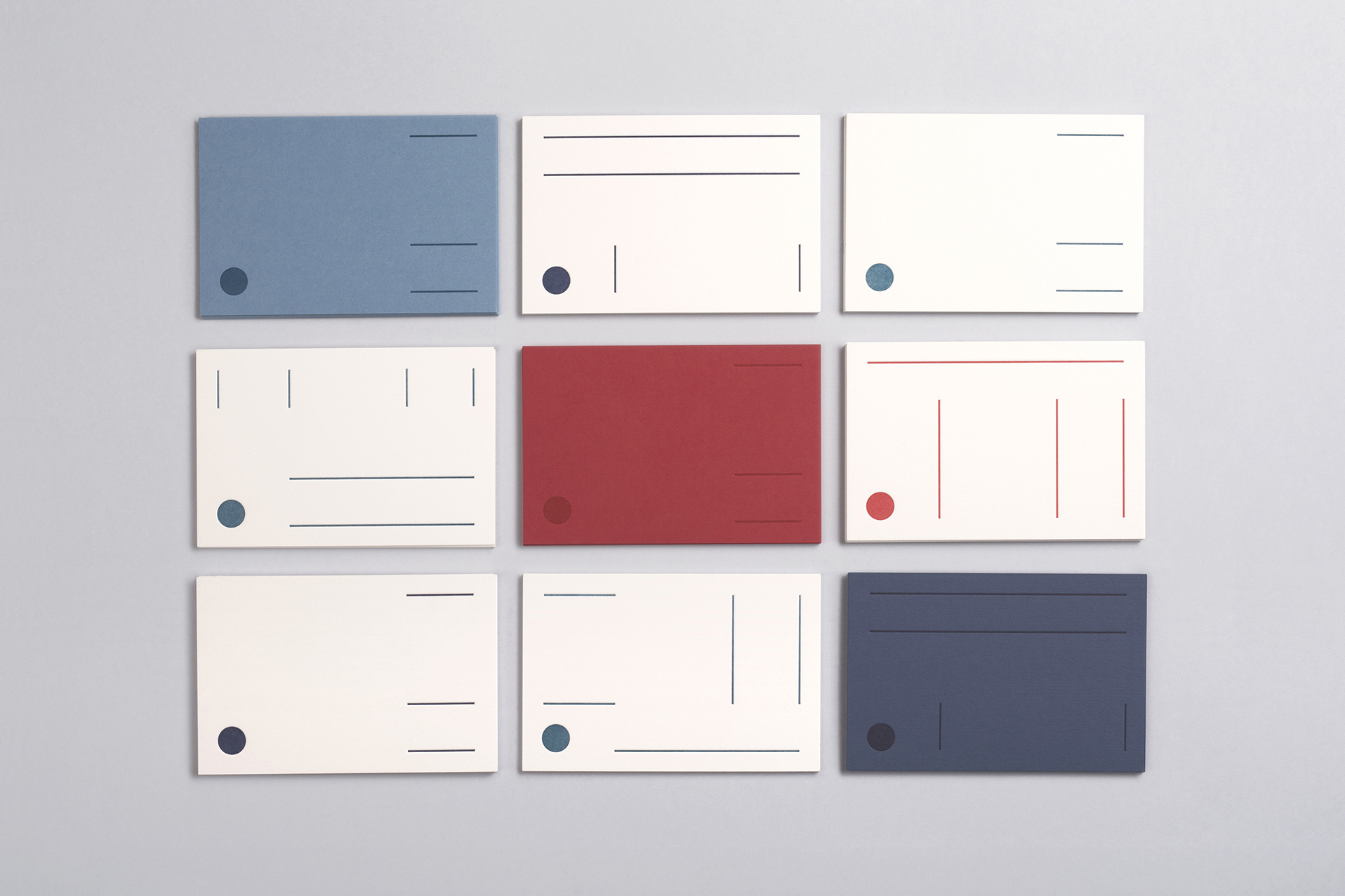
One of the main challenges of the creative brief was to keep the initial shape of the logotype and corporate colors, which is why we maintained the colours (navy blue, blue and red), but selected new shades of them and adjusted the logotype proportion.
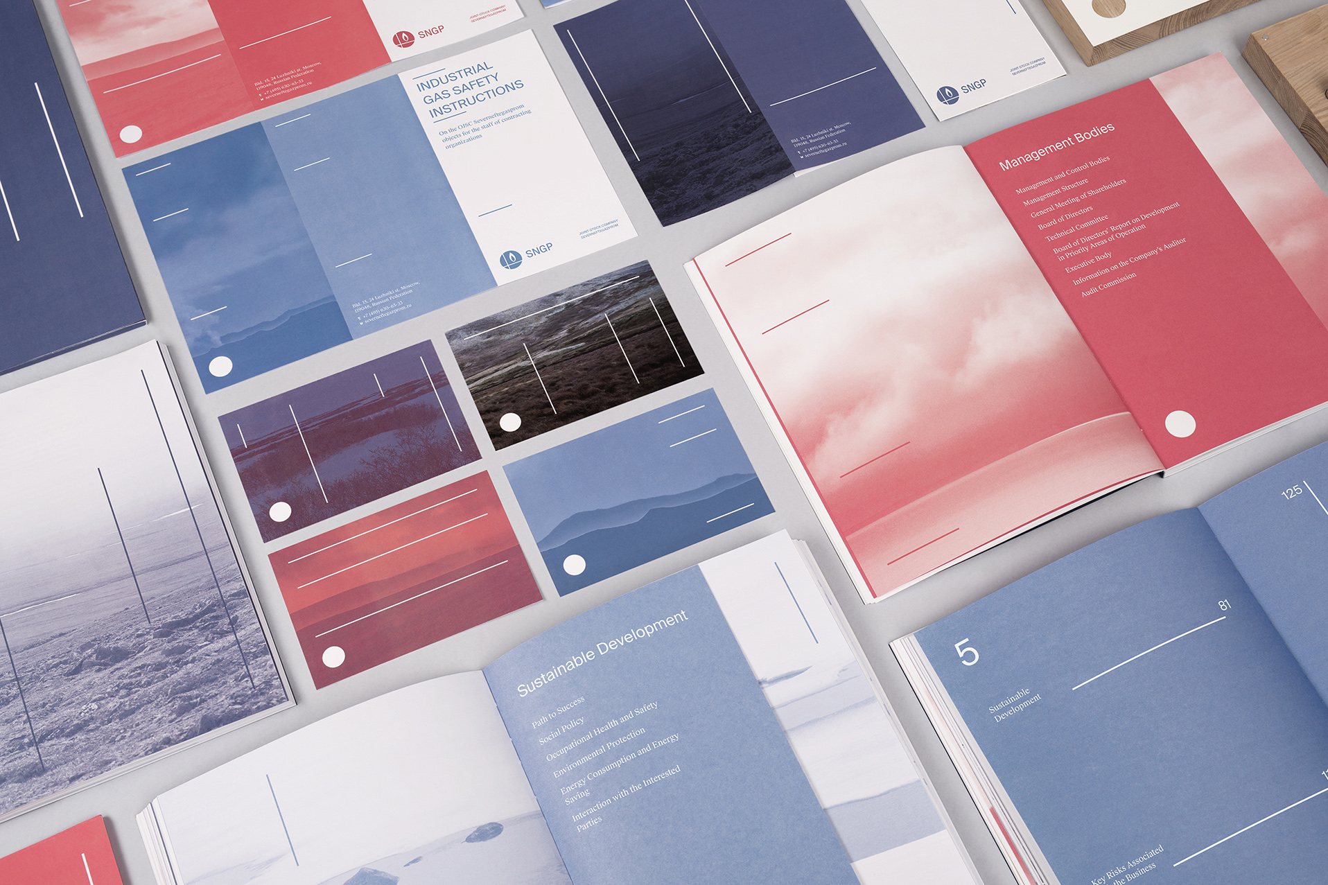
Based on the geometry of the logotype we found better aesthetic solution for it and constructed the style concept around it.
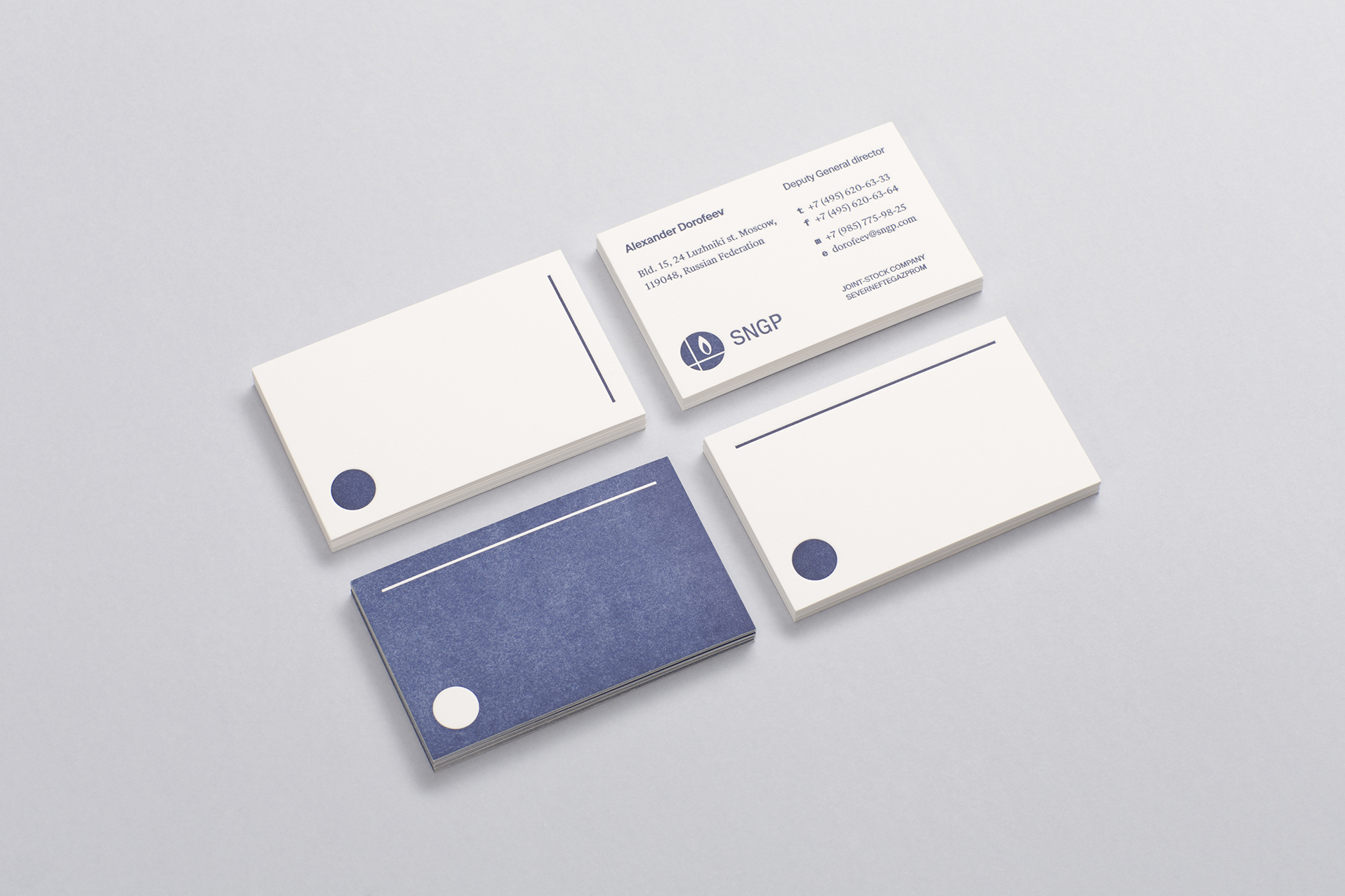
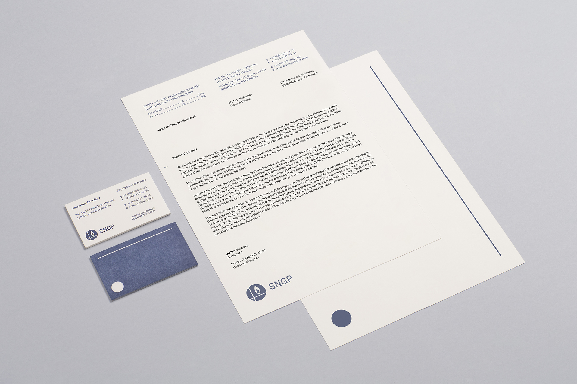
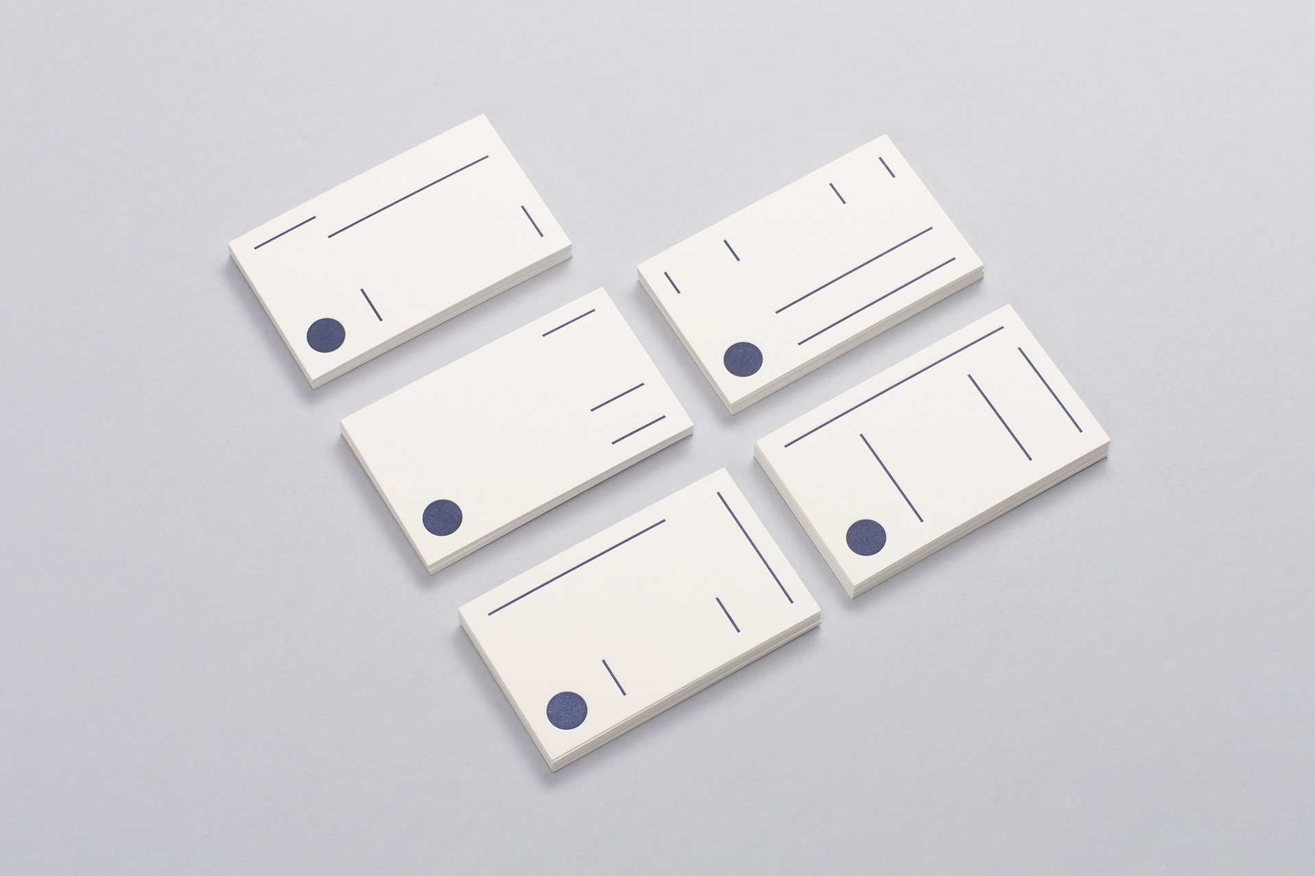
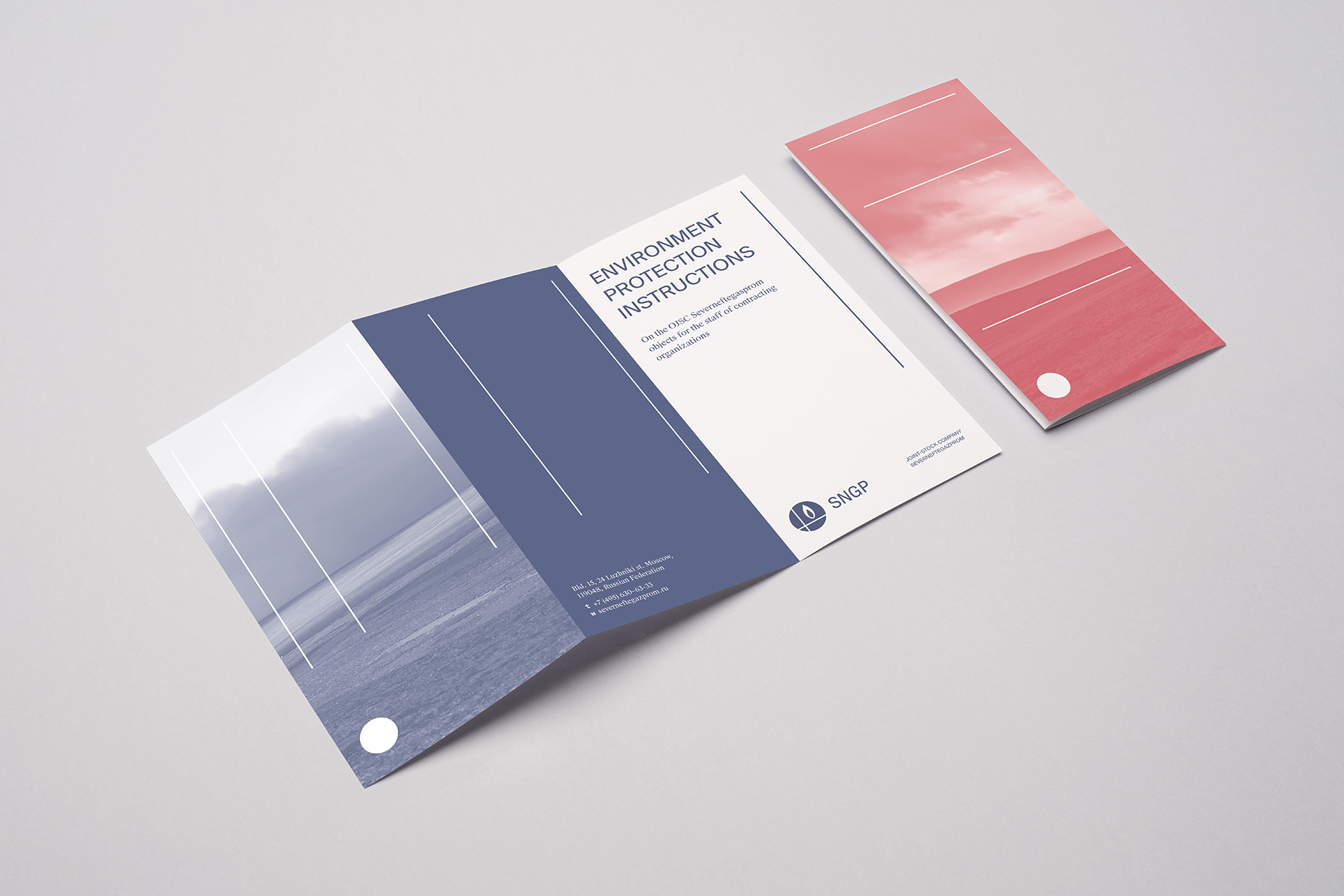
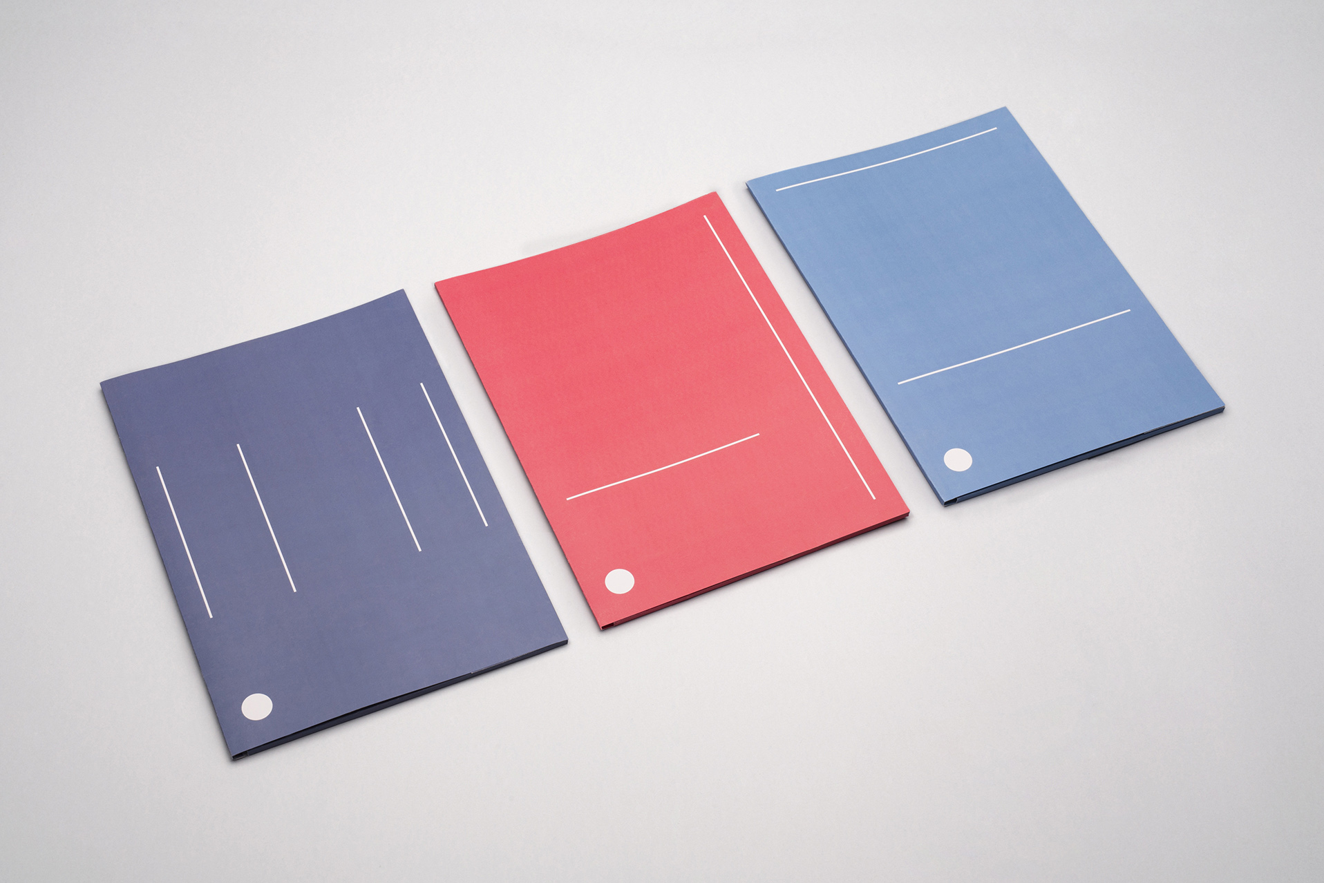
We have deconstructed the logotype of the company and got three basic graphic elements that represent the company’s activities:
— point – field and exploration, this could be compared with a point on a map, because field and geological exploration are starting points of the activity of the company.
— the vertical line could be compared with the well drilling and gas collection.
— the horizontal line represents the final stage of activity – transportation, because collected gas is transported to Europe through the Nord Stream pipeline.
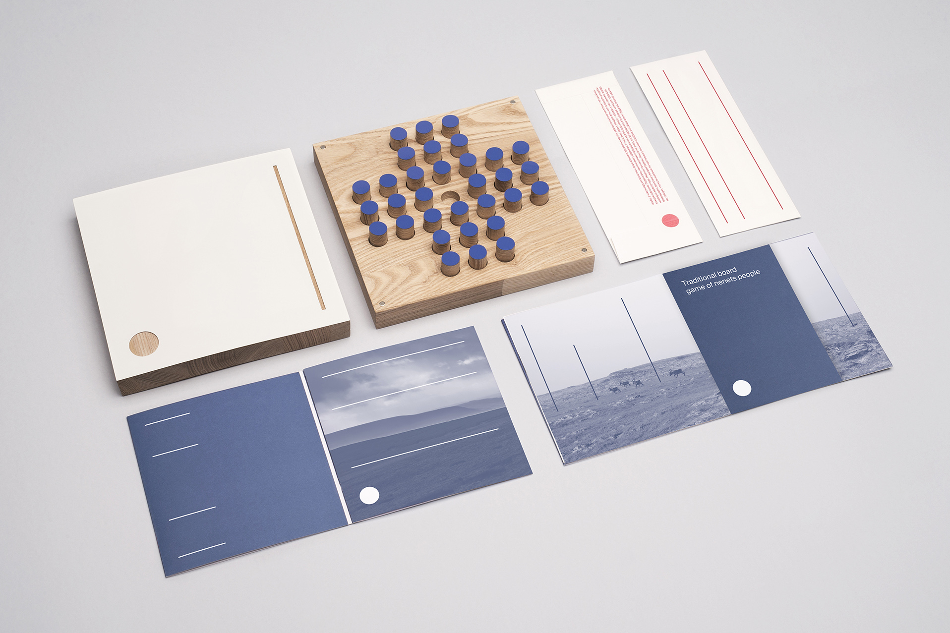
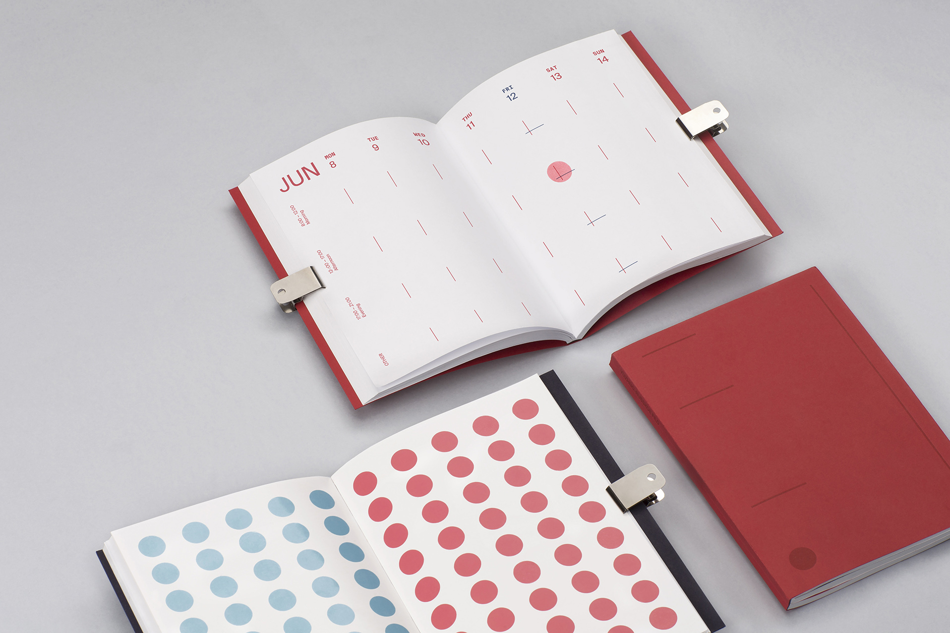
We redesigned the logotype proportions and built the system based on it. The length of the words in logotype “sever”, “neft” and “gasprom” creates the grid for graphic compositions. The visual identity system is based on graphic compositions which consist of the point, vertical and horizontal lines. That gives an abstract association with the company’s activity. Photos, toned in the corporate colours with graphic elements, are used in the design to show that the field is located in a unique and beautiful place.
Составляющие проекта:
Награды:
Креативный директор:
Дизайнер:
Технический дизайнер: